- Merchandise Design
- | Brand Identity
- | UI Design
- | UX Design
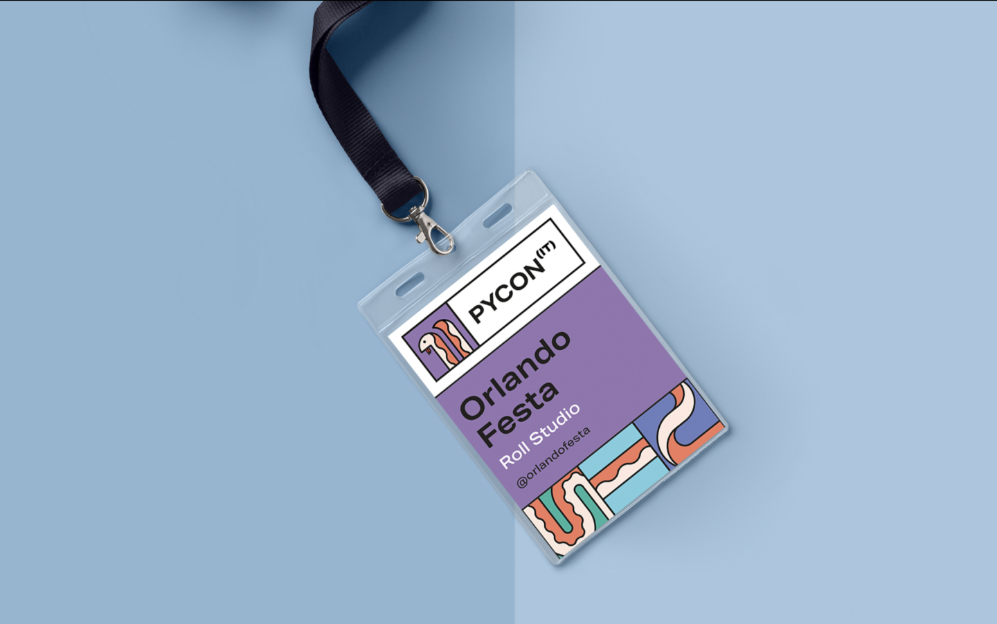
We had the privilege of partnering with PyCon Italia, a renowned Italian Python conference, to enhance their brand identity, website design and merchandise offerings. As a leading Python conference in Europe, PyCon Italia sought to elevate its visual presence and create merchandise that reflected their esteemed status within the tech community. Through collaborative efforts, we successfully delivered a fresh brand identity, a visually striking website and a range of colourful merchandise, including t-shirts, badges, and lanyards.
A creative journey to reimagine PyCon Italia’s brand identity, infused with vibrancy and modernity while staying true to its roots. Working closely with PyCon Italia’s team, we conducted in-depth research to understand their goals, values, and desired brand perception.
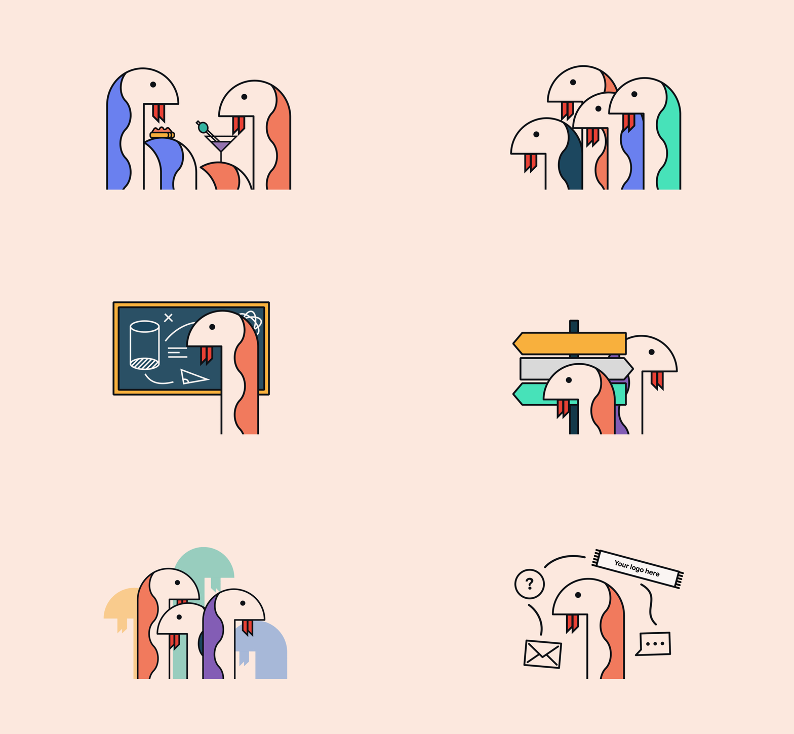
We crafted a brand identity that featured a captivating combination of colourful illustrations, sharp lines, and a contemporary aesthetic.


The revamped brand identity captured the essence of PyCon Italia, striking a balance between professionalism and creativity. We ensured that the new visual elements seamlessly integrated into their digital platform, establishing a cohesive and engaging user experience. We employed an iterative design process, incorporating feedback from PyCon Italia stakeholders at every stage, resulting in a final brand identity that was truly representing their vision and personality.
With a user-centric approach, we designed an intuitive IA that ensured seamless navigation and accessibility for attendees seeking information about the conference. One of the unique challenges we faced was creating different IA structures that aligned with the various moments of the event, including pre-event, sales, during the event, and post-event. Ensuring a smooth and delightful experience throughout these different phases was crucial to keeping Pycon’s participants satisfied.
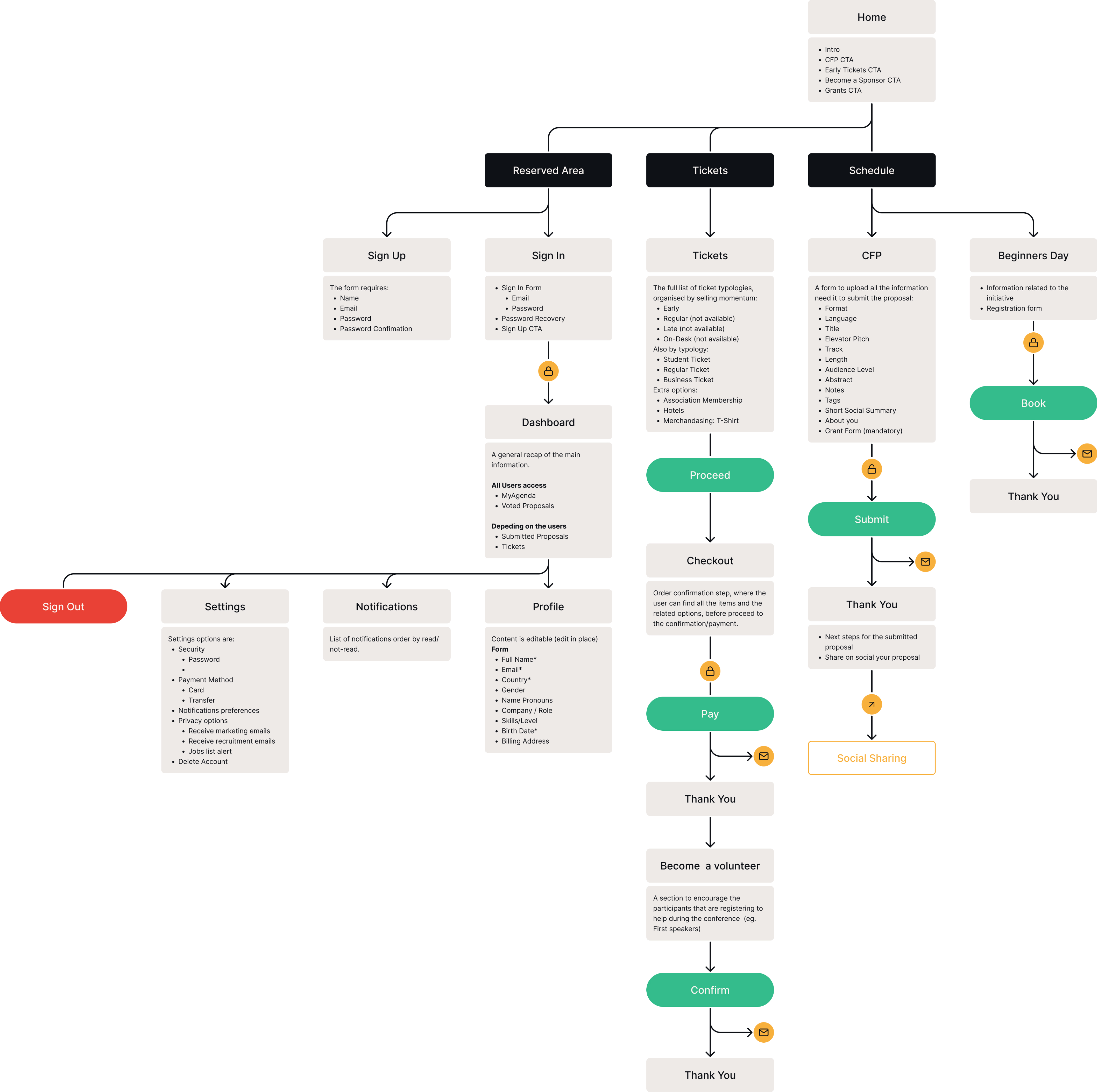
Through extensive user research and usability testing, we refined the website’s structure, categorising content logically and implementing clear navigation menus, search functionalities, and information hierarchy.
The UX was meticulously designed to create an immersive and engaging experience for visitors. We incorporated visual elements, such as illustrations and colour schemes, to enhance the overall aesthetics and create a cohesive brand experience. We focused on optimising user journeys, streamlining the registration process, and providing essential information about the conference, schedule, speakers, and workshops in an easily digestible format.
In addition to the brand identity revamp, we designed an assortment of merchandise. We translated the new brand identity into tangible items, including eye-catching t-shirt designs, stylish badges, and functional lanyards.
