- Branding | UI | UX | Strategy
CCE is a science backed organisation that presents positive changes for the industrial sector to manage carbon, a key factor in driving worldwide climate change. We were asked to create a brand that made the complex simple and encourage uptake in joining the Circular Carbon Economy.
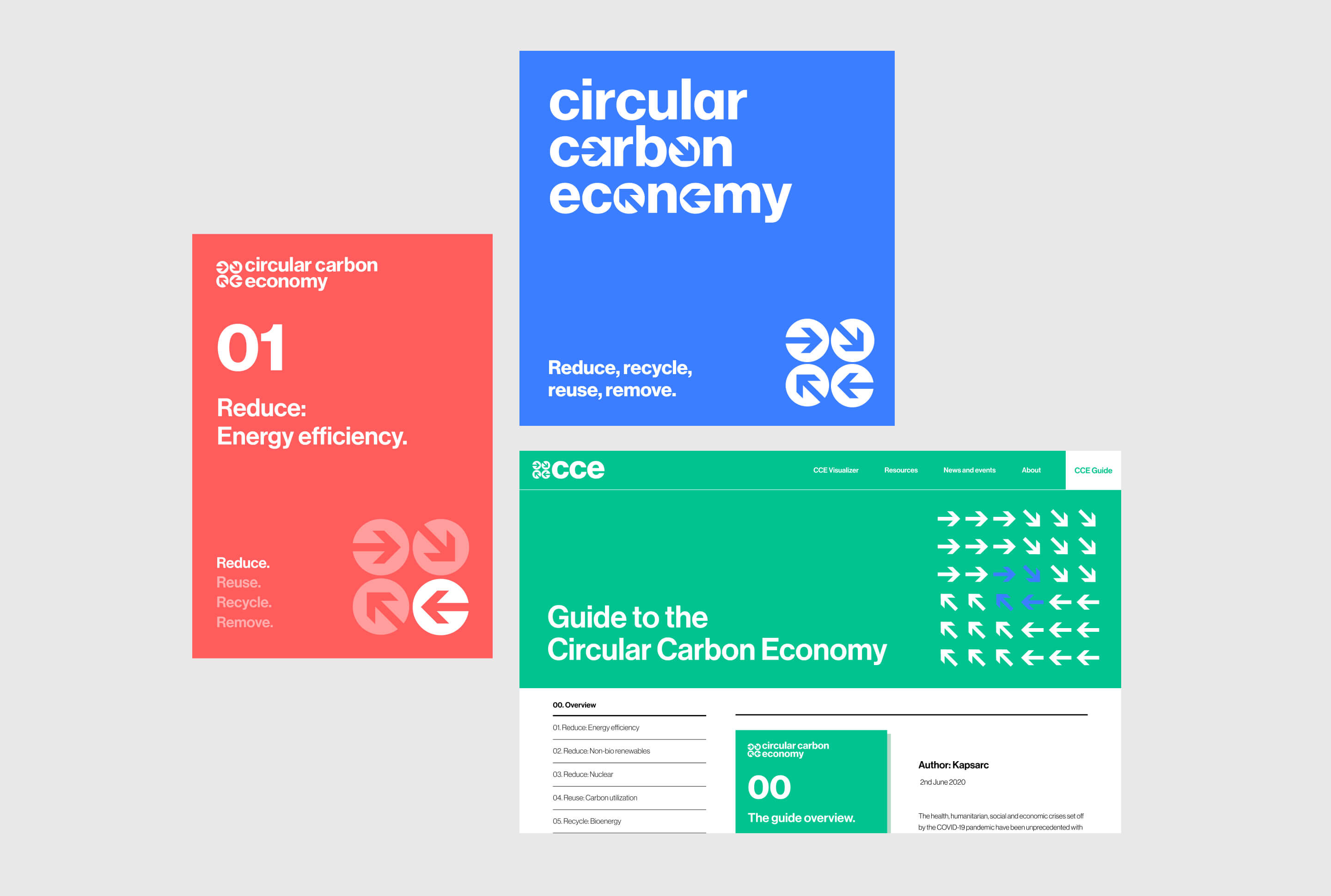
The 4 R’s – Reduce, Reuse, Recycle, Remove – are the main principles of the Circular Carbon Economy. The identity carries these at its core in 4 arrows built into the logo and icon. Each arrow pointing to the next giving the feeling of circularity, direction and a sense of movement.
With many pieces of documentation it was important to build a consistent sytem for cataloguing information. The visual system utilises clean typography, colour and iconography to create visual consistency across assets from digital to print.

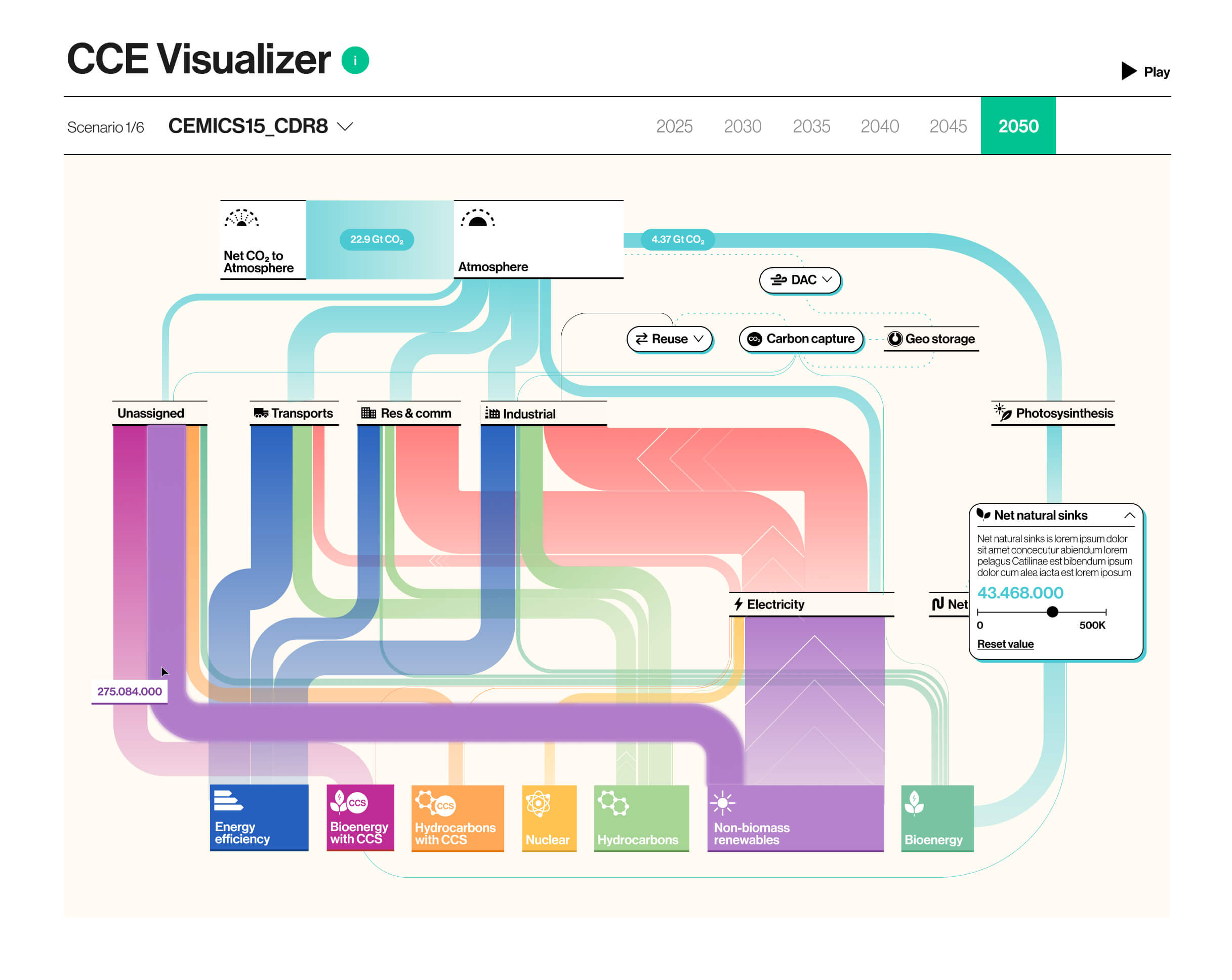
A key part of the online experience is the CCE Visualiser which allows for complex carbon usage scenarios to be tested out. Making the theory behind the circular carbon economy clear for all to understand.

